From content style guide to a governed product workflow
CyberArk, now part of Palo Alto Networks, secures identity touchpoints for large enterprises. Around twenty excellent technical writers owned the words inside that platform. However they were working without a product-content system: no shared standard for how product text should read, and no agreed workflow for producing, reviewing and handing it off to design and dev. This case study follows that arc: research the organization, write the governance, teach the people, make the governance executable, join it to the design system, and platformize an AI-powered UI and text generator.
The documents from the time are here in full, and you can open them. The screens have been rebuilt because the originals are locked down under a strict NDA.
Twenty writers, one platform
The writers at CyberArk were based primarily in documentation, where the craft is different: a doc explains a system at length, to someone who has chosen to sit down and read it. Product text works inside the system, in a handful of words, for someone who is mid-task and probably anxious. Each writer solved that on their own, so the same action carried different verbs on different screens, and design reviews kept relitigating terminology that one shared pattern could have settled once.
Before writing anything, I met the leaders across product, UX, the design system, dev, content, and support to understand how the company actually built software and where content entered it.
Start with the secret sauce
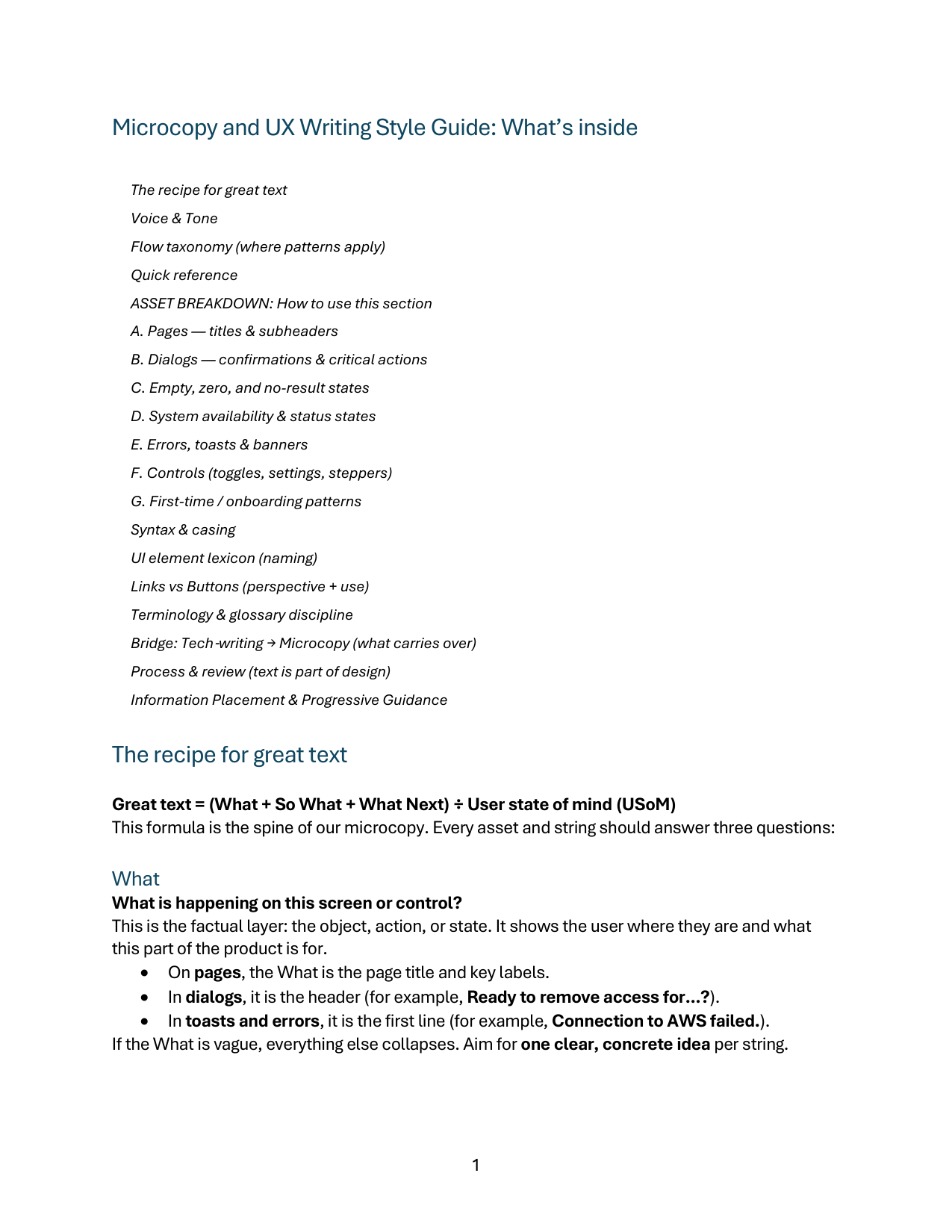
I wrote the V1 Microcopy and UX Writing Style Guide around a single spine: Great text = (What + So What + What Next) ÷ User state of mind. The “What” is the factual layer, the page title, or the first line of an error. The “So What” is the consequence, the reason this matters right now. The “What Next” is the action, a verb and an object, scannable out of context. A writer who has those three and knows who is reading has already made most of the decisions.
User state of mind is the divisor because it tweaks the tone of everything above it. The guide defines it as intent + emotion + environment, and asks the writer to note all three before drafting: What is this person trying to do? How are they likely to feel? Where are they doing it?
To align with user state of mind, the direct, clear, transparent, simple voice can be varied through the lens of five tones. The tone moves with the situation, with “Instructive” as the default and “Helpful” or “Reassuring” when a person is blocked or anxious.
The guide includes seven major asset patterns, written as fill-in-the-blank templates: pages, dialogs, empty and zero states, availability states, errors and toasts, controls, onboarding. The grammar of those templates is deliberately physical.
Terminology got the same treatment. One term per concept, defined once, used everywhere: “Remove access” and “Remove account” replaced the mix of “Delete,” “Remove it” and informal variants that different teams had each settled on separately. The guide also carried process rules: real strings at the wireframe stage rather than lorem ipsum, before-and-after capture for traceability, and a status chain from “In progress” through “Reviewed” to “Done”.
Onboarding the team
To help the team adopt the process, I built and ran a workshop series for writers that grounded every UX writing decision in the cognitive science of how people see, read, remember, decide, make mistakes, and recover. We asked all the questions a designer actually asks mid-task, then offered the mechanism to answer them.
This process gave a shared language for reviews and editing: Cognitive load, recognition over recall, slips versus mistakes, progressive disclosure. A reviewer could point at a mechanism instead of trading opinions about taste, and a writer could defend a decision with a reason rather than a preference.
The next step was to make the rules machine-readable. I rewrote the guide as structured Markdown and instructions, and integrated those rules into the writing team's existing DocuBot, which until then had mostly served documentation work. A writer could now ask for a draft of microcopy as well and get one that already knew the approved pattern and terminology.
Dovetailing content and design
In parallel to my style guide work, my colleague leading the Design System was building a way to produce UI that came out already made of approved Design System components, scaffolded in Figma Make. However, it only solved half of the problem: generated UI that is structurally correct but still arrives full of placeholder language.
Enter the Content Style Guide. Now transformed into Markdown, we collaborated on the architecture of embedding content governance inside the UI generation workflow. We landed on a repository-backed project that held Design System context, the content rules, and the generation scaffolding, all usable from Figma Make.
What that combination produced was UI carrying both kinds of governance at once: components and tokens the Design System had already approved, and product language that already followed the patterns, the tone, and the terminology. A reviewer opened something nearly fully baked, instead of a page of slop with many decisions still left to make.
We tested it informally with people across Product, UX, the Design System, development, Content, and Support. We built a richer intake, so a request could arrive with a description of the problem, screenshots of the screen as it stands today, and supporting files. We evolved the orchestration layer, with Claude connecting that task-specific evidence to CyberArk product knowledge, the Design System context and the content rules.
Putting it where the work already lives
As we moved beyond that first cohort of early adopters, we brought a developer onto the project to create the architecture connecting the workflow into Jira.
The entry point appears on relevant issues and tasks, filtered by epic, project, type, component, and permissions.
The panel states exactly what leaves the issue, because a person is more willing to use a tool that tells them what it is taking.
What arrives on the other side is the issue as a brief, with its own supporting material attached. Then, before anything generates, the system says what it understood and what it is still unsure about. Open questions get answered or explicitly waived.
From the bottom up
Often, support sees the same problem countless times before product ever hears about it. The second entry point in Jira offers a way for stakeholders to create a new task with a product optimization suggestion, already bundled with a system-approved mockup to hand off through the chain. The output is a working Figma file rather than a picture of one. It is editable, made of Design System components, and it is where the team keeps working: the proposal is the start of the conversation, not the end of it. The proposal enters the ordinary product queue where Product, UX, the Design System and Content triage it like anything else.
Streamlining the back-and-forth
Usage and reactions were self-reported, through feedback and conversations during rollout. Timing came from task-manager signals, comparing work that went through Experience Builder against comparable work that did not. The later operational figures, including the adoption share, were reported to me by the original Design System manager after I had left.
The mechanism successfully reduced meetings and rounds of clarification. A writer could now take a problem and produce something concrete to react to, which changes the shape of a review. Product could hand UX a fuller picture from the first ticket. The governance that used to be enforced by whoever was most senior in the review was now applied before the review started.
As a writer at heart, I was most proud of the soft impact of consistency: syntax, cadence, framing and terminology started matching across product areas that had never coordinated. Writers still made the final call on every string, but they could make it starting from an agreed system rather than renegotiating the same language decisions on every screen.
Support's evidence turned into dozens of small fixes: the kind of accumulated, unglamorous correction that never gets a launch announcement and is most of what makes a product feel considered.
Behold the KantorBot, coming soon
I am building a generalized version of this thinking now, as a separate product called KantorBot. The webapp will be baked into my portfolio, allowing you to use the best UX brains and content guidelines to get microcopy solutions for any situation, and even full UI wireframes when the case requires it. Watch this space.
Governance, enablement, execution, workflow
Twenty writers were producing product language without a shared system. I researched the organization, wrote the standard, and taught the reasoning behind it before automating any of it. Then I made the standard executable, joined it to the Design System so generated UI carried both kinds of governance at once, and helped design the workflow that put it inside Jira, where the work already lived, making sharing and collaborating on solutions easier for everyone.